“To translate is to betray,” the old Italian adage says — but what if translation isn’t betrayal at all? What if, instead, it’s a quiet act of design diplomacy?
In a region where luxury and identity are in constant dialogue, translating a brand into Arabic is no longer just a linguistic task — it’s a design feat, a cultural decoding, and often, a high-wire balancing act between reverence and reinvention.
At Between The Lines, we’ve long believed that what sits between words — and worlds — is where the real story lies. In recent years, we’ve worked closely with global brands as they expand into the Middle East, helping them preserve their DNA while finding a new voice in Arabic — one that feels native, not foreign, and fluent, not forced.
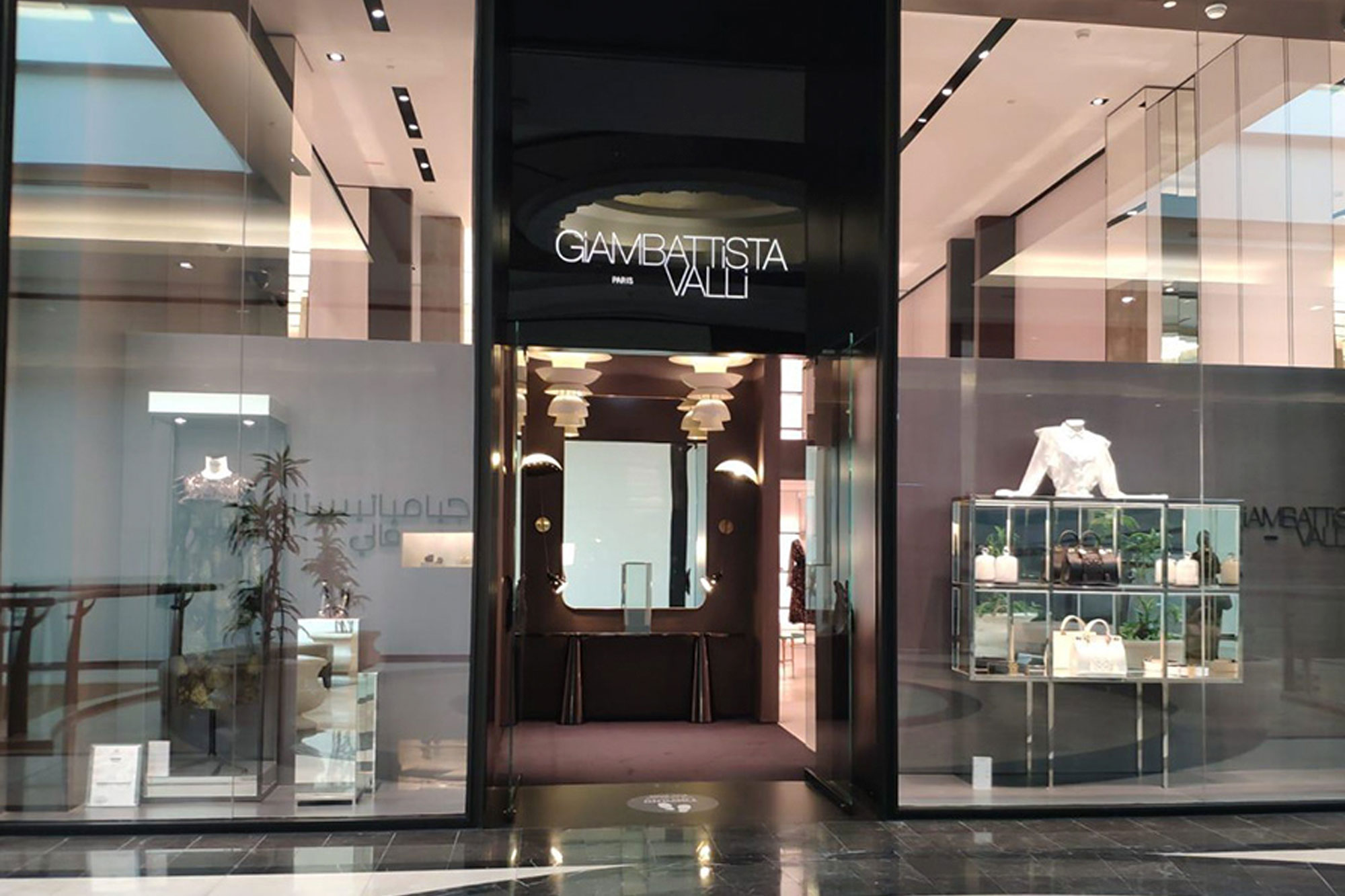
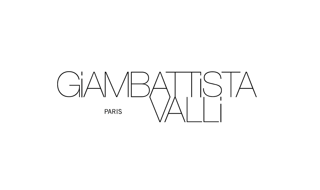
Take, for example, the case of Giambattista Valli, the revered Italian fashion house. When they opened their flagship store in Doha, it wasn’t just about bringing couture to the desert. It was about ensuring the brand’s presence spoke the same language — quite literally — as the culture around it. The brief was deceptively simple: translate the identity for an Arabic-speaking audience, without losing the signature grace and modernity that defines the Valli brand.
But herein lies the rub: Arabic typography, with its calligraphic curves and emotional density, does not mimic the structure of Latin scripts. It flows, loops, dances. The challenge isn’t just in finding the right letterforms — it’s in preserving the mood. A lowercase “g” in a Latin typeface might feel playful or delicate; its Arabic counterpart might suggest something altogether different. And so the designer becomes a kind of translator, yes, but also a cultural interpreter.
“Arabization isn’t about replication — it’s about resonance,” says Nayla Lahoud, founder and chief creative director at Between The Lines. “We’re not just translating a name. We’re translating intention — style, tone, elegance, edge — all through form.”
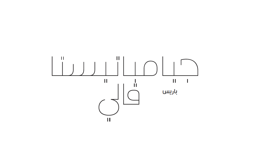
Sometimes that means drawing our own Arabic letters to echo the energy of its original. Sometimes it means building a new visual rhythm that feels authentic to the region but doesn’t alienate the brand’s global audience. It’s a subtle form of code-switching, one that happens not in language, but in ligatures.
Branding Across Borders
The rise of Arabization in brand design reflects a deeper shift in the region — one where global luxury, digital-first startups, and heritage-rooted businesses alike want to connect with audiences not just through commerce, but through culture. From bilingual packaging systems to full Arabic rebrands, the stakes are no longer just visual — they’re emotional, generational, even political.
And while some brands take a “cut-and-paste” approach, relying on Google Translate and generic Arabic fonts, the brands that truly stand out — and stand the test of time — are the ones that invest in meaningful localization. That is, they don’t just enter a market. They speak to it.
“Designing in Arabic is not just about fluency in the language,” Nayla says. “It’s about fluency in the rhythm of the region. In the way meaning unfolds.”